HELLO, I'M Amanda Hayes
Design & Development
Marketing & Communications
I’ve spent the last decade in journalism and marketing, honing my skills in design, communications, and web development to bring innovative solutions for my clients. My extensive time at news organizations has allowed me to work with diverse audiences in both the public and the private sector and taught me the importance of communications and PR for organizations big and small.
Some of my proudest accomplishments include transitioning organizations from print to thriving digital news sources and revamping my clients’ brands to make them more connected to the communities they serve. As a digital native, I love integrating new technology with traditional marketing strategies to provide customized, high-quality solutions.
My work in consulting and freelancing has allowed me to learn a variety of new tools and technologies to solve problems creatively. I’ve done branding, marketing, web and graphic design, and created communications strategies for a diverse set of clients including content creators, preschools, produce stands, investment firms, and chambers of commerce.
Fueled by a relentless drive to bring value in all forms, I often pursue education and training in new skills and technologies to ensure I stay up to date with industry trends and digital best practices. I’m really proud of the creative solutions that have come out of my love of continuous learning and desire to achieve my clients’ goals.
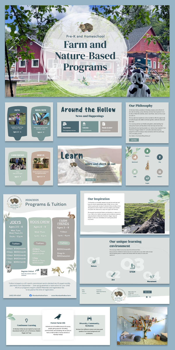
I loved working with Wombat Hollow Farm. They were opening a new preschool in our area and needed some branding, communications, and a new website for their business. I created their logo, color palette, typography and brand voice. I wrote and designed marketing materials, price and information sheets and created the content for their website. I then built their website using the WordPress platform.
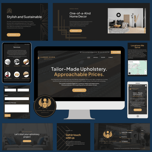
I worked with the incredibly talented Charming Scarab Upholstery to create a logo, branding materials and a new WordPress website in 2025. I had a great time figuring out how to use the website to best tell the story of this creative designer.
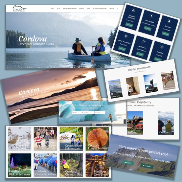
The Cordova, Alaska Chamber of Commerce website remains one of my most ambitious undertakings. The chamber wanted a new site to reflect a more modern user interface, but the biggest priority for them was introducing a myriad of powerful features to improve their serviceability for the businesses they support, visitors coming to Cordova, as well as the community at large, who relied on them for important information about the area.
The first feature we worked on after prototyping the new UI was their business directory. They wanted a searchable database of all the businesses that belonged to the chamber, with their logo, contact information, a map showing their location, and external links. This was something I hadn’t done before, so researching a solution was fun! I found a powerful plugin for WordPress that ticked most of the boxes, however, not everything they were looking for was included, so I had to write some custom PHP code to ensure the solution met their needs.
After that, they also wanted their own events calendar and jobs board that users could submit to and pay through the site, as well as an advertising program so their members could market their company around the site. With the help of some plugins and a bit of customization, I was able to implement rotating ads on their most popular pages that cycled through their advertisers each time the page was refreshed. This brought in tons of new revenue and opportunities for expanding their product offerings.
While the features I implemented were some of the most detailed and complex I had ever worked with, I have to admit my favorite part of working on this site was creating the user interface and design. Alaska is home to some of the earth’s most picturesque landscapes and incredible natural features, and this provided me with absolutely stunning photography to include on the site to attract visitors. I was eager to use my design chops to display them prominently and show the unique natural characteristics that make Cordova so attractive. I loved working on this site and it’s some of the most accomplished work I’ve done in my career.
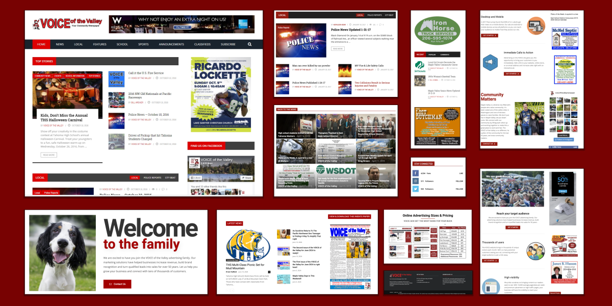
The VOICE is one of my longest-running projects to date. I’ve been working with the VOICE in one form or another since 2008. The bulk of my experience in communications and marketing started in 2014. I was tasked with building and deploying a new website and kick starting their transition from print to digital news. This was a multi-year project that is easily one of my proudest achievements.
After agreeing to take on the project and role of digital communications specialist, I got to work gathering requirements from the appropriate stakeholders, including all departments of the newsroom. Not only did I need to find a new system to manage the digital news content, it needed to be user-friendly enough for employees without technical backgrounds to learn and regularly use. After this stage, the research began. I compared several content management systems and ultimately decided that WordPress would be the most versatile platform for our needs. The flexibility it offered in addition to the ever-expanding functionality, coupled with a low barrier to entry made it the right solution for us. I had never worked with WordPress before, so I spent a considerable amount of time studying their documentation and watching tutorial videos from other users to learn the ins and outs of the system. Finally, I began the process of building the new site and migrating our content.
It was a long and sometimes frustrating process, but relying on the documentation, trial and error, and leaning on colleagues with more experience allowed me to build and deploy what I consider a stunning, high-powered digital news platform to serve our community and bring people the content they want to see and integrate features that matter to the community. Utilizing my skills in graphic design, web development, writing, and content creation allowed me to create a truly exceptional experience for our users.
In addition to news, I implemented new features to expand the product offerings of our paper. I created a new media kit, digital advertising program, and content offerings that significantly increased our readership and brought in new streams of revenue that were previously untapped.
I’m truly proud of the work I did while building and managing this website and am so grateful for all the skills I acquired along the way.
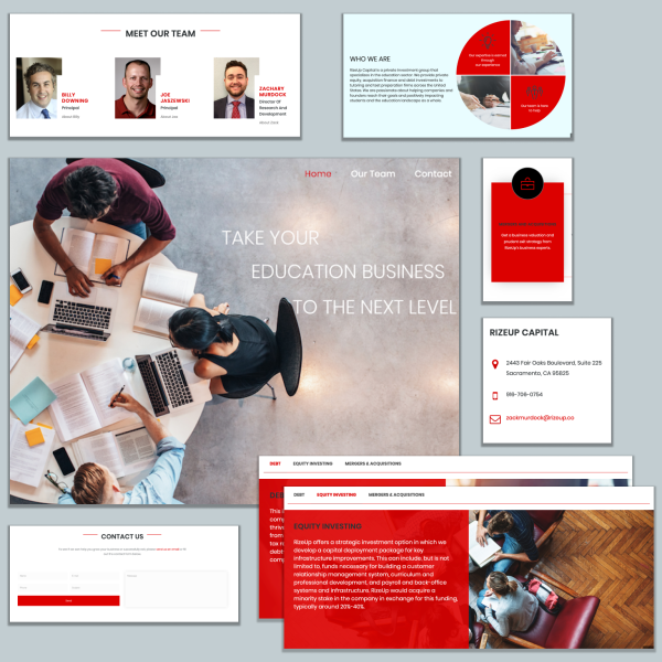
Once again I partnered with my colleague at Kern This Studio to build and deploy the website for RizeUp Capital, an education and equity investment firm. They were looking for a simple, modern website to attract potential clients. They wanted a stark, vibrant color scheme with loud reds paired with black for maximum visibility and personality.
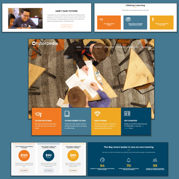
I partnered with my colleague Annette Potter to build a new site for Tutorpedia, a popular tutoring company in California. They wanted a site with a user interface that was clean, modern, and welcoming for students and parents looking for professional tutoring and test prep solutions. In keeping with the educational look and feel of bright, multi-colored elements, we opted for more muted tones that made the site feel less like a kindergarten and more geared toward mature students in high school and college.
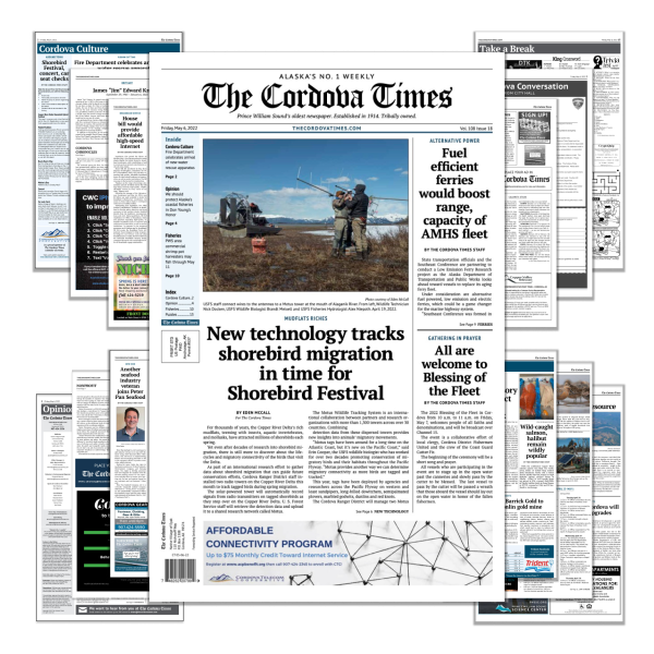
I designed this edition of The Cordova Times for my colleague, who was going on a trip and needed someone to fill in to assemble the pages and send them to the printer for publication. I used Adobe InDesign to layout the pages, and Photoshop to format and edit image assets. Fortunately, the managing editor had some incredible templatizing tools and InDesign-specific asset libraries that preformatted their fixture labels, paragraph, and character styles to ensure they adhered to the design standards of the paper, so that made putting everything together much easier. My favorite part of filling in to design the pages was getting to read all the week’s news!
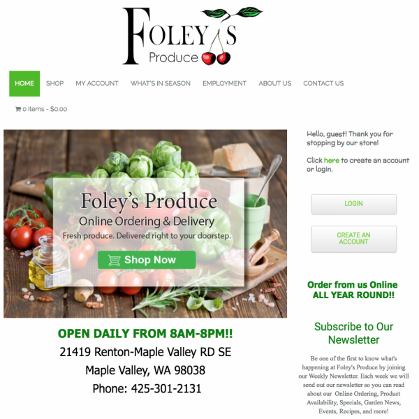
Foley’s is a multi-generational produce stand that is a pillar of its community, and they were ready for an upgrade. Their previous website was useful but the design was dated and the functionality could have used some improvement. As I recently had a lot of success building WordPress sites for many other businesses at this time, it was only natural we migrate to the platform for this product.
One of the most important features I implemented on this site was online shopping. The owner was planning on getting into produce delivery, and wanted his website to compete with local grocery stores. This was an exciting project because I had never implemented full e-commerce functionality before, and it was a monumental undertaking. Not only did I have to create attractive shop and product pages to encourage visitors to sign up, but I also needed to implement full payment processing directly on the site, and this came with unique challenges.
There are many data privacy and government regulations surrounding e-commerce, and more specifically food delivery that needed to be followed. As users were entering their credit card information directly on the site, security and encryption was our top priority. Fortunately plugins like WooCommerce helped with a lot of the basics, but there were also many customizations that needed to be done to meet the specific needs of the business. I distinctly remember needing to spend several days writing a piece of code that allowed the users to secure a delivery slot when placing an order, as WordPress didn’t have a way at the time that met our needs.
This was another site that tested and expanded my skills in many areas of marketing and technology, and I learned so much about e-commerce and payment processing, as well as produce! I’m so grateful I was able to work with them.
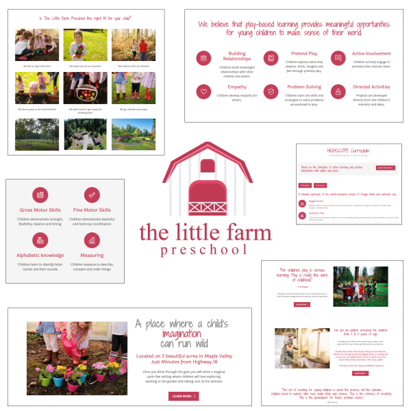
I was so excited to partner with The Little Farm Preschool on updating their website. They had recently introduced new branding and were looking to reflect that on their site, which was built using different colors and typography that didn’t match their new look, so that was the most important feature to focus on.
After revamping the design, we decided to expand the functionality of the site to allow users to register their children for preschool and automatically format and send the data to the owners who would then follow up and integrate it with their own software. This feature was very useful for them, as it eliminated several time-consuming steps in the registration process and allowed them to avoid needing to hand copy forms submitted from parents and try to decipher the writing. I continued to manage the site for them for a few years afterwards, and I really enjoyed working with them.


